Deliverables:- Final product suitable for branding purposes
Role :- Graphic Designer
Challenges
Design must be Simple: – A personal Brand that encompasses music and the arts. The brand is also the personality
Eye Catching – The clients personality must be easily recognized by the logo
Objectives
Create a brand identity for a musician whose brand is his personal name. It also must tell his story and what he is about
Chosen Sketch Design
After preliminary sketches were presented to the client, this was the chosen sketch that the client decided to use to represent his branding identity
---> This was then digitized using the design software, where the images were tweaked and further iterations were made to achieve the final result
The logo vividly comes to life in a full-color 3D representation, serving as the primary emblem of the client's brand identity. Through its intricate design, it intertwines elements of music, symbolizing the client's connection to the vibrant world of sound and creativity. The form eloquently shapes the initial letter "K," capturing the essence of the client's name while echoing elements that resonate within the music industry. This logo not only stands out visually but also tells a story, inviting audiences to engage with the brand on a deeper level. Its dynamic colors and three-dimensional qualities reflect the innovative spirit of the client and their nationality, positioning the logo as a memorable and integral part of their branding strategy.
**HEADPHONES + DRUMSTICK + K
= FINAL PRODUCT ( KAIL) **
ALTERNATIVE LOGOMARKS
Full Colour Flat Logomark
Monochrome Logomark (Black)
Gradient Logomark
Monochrome Logomark (White)
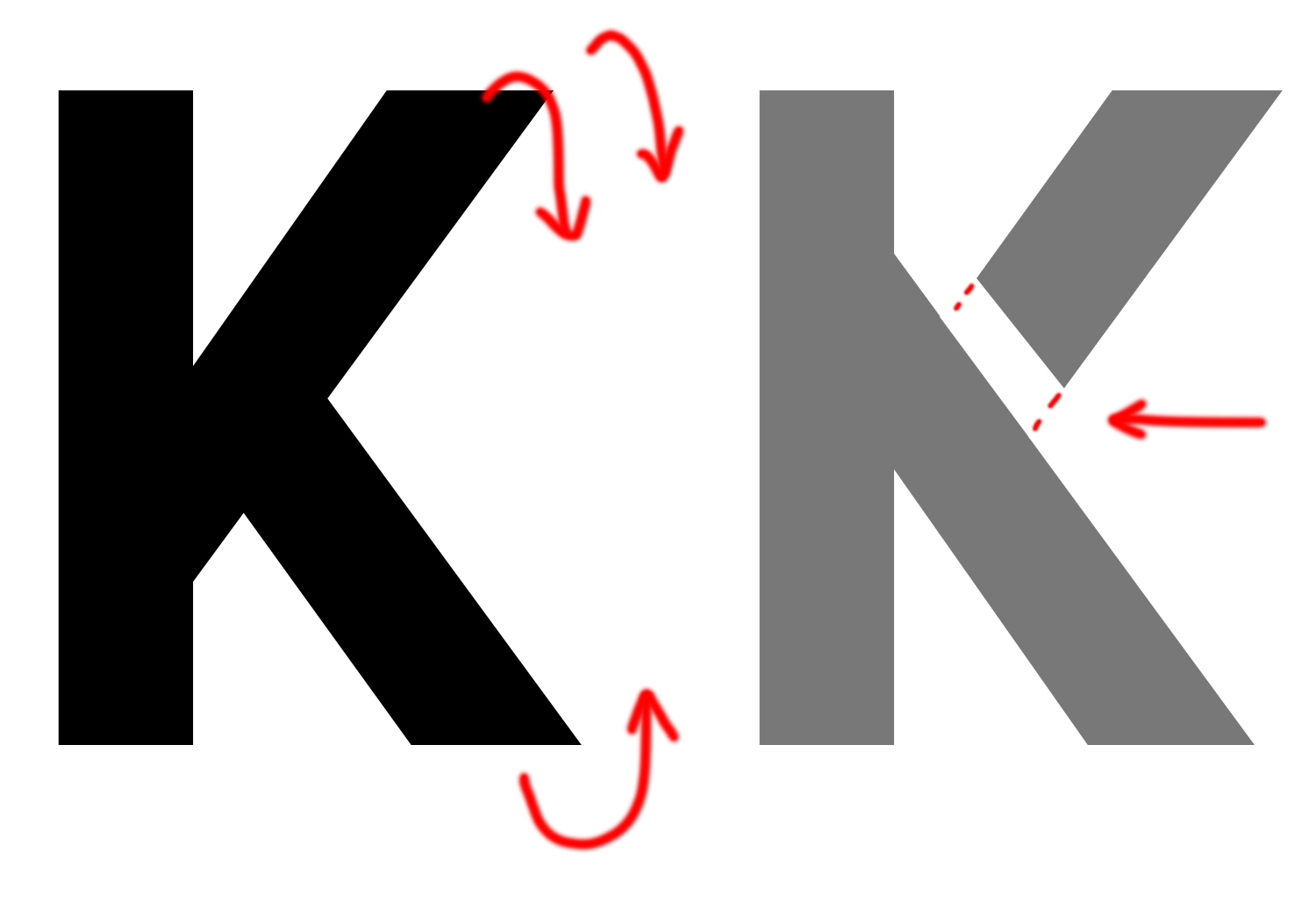
Typography : Salmond
The Chosen typeface was edited and modified to both reflect the pictorial aspect of the logo and
in keeping with the shape of the text used in the logo
The lettering was Mirrored Vertically
The Leg was also edited by being removed to create a similar look to the Logomark
The same type of modifications
were applied to the other letters in the name to add to the familiarity
and likeness throughout the text
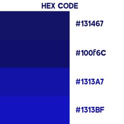
Colour Palettes
Branding
Stationary Branding
Garment Branding
Promotional Branding
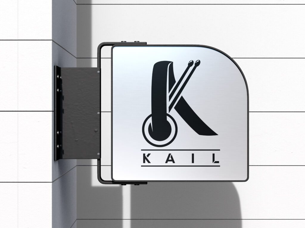
Signage
Final Product
The final product was a visually captivating and functionally efficient design that not only met but exceeded client expectations. The brand identity received positive feedback from users and was able to communicate and identify with its audience.